Showing posts with label rubber stamping. Show all posts

Thursday, 12 January 2012

Some stunning new papers!

Two posts in one day (can you tell I'm procrastinating the housework)!

I think I've said before on here how much I love the work of the talented Finnabair (see her blog here). She just has the most incredible and gorgeous sense of colour and texture in her work. Clearly I'm not the only one who thinks so, as she has now designed her own scrapbooking papers for 7 Dots Studio.
Her first collection was called Dreamer and her second, due to be released very soon, is called Wonderland, loosely inspired by Alice in Wonderland (see here).

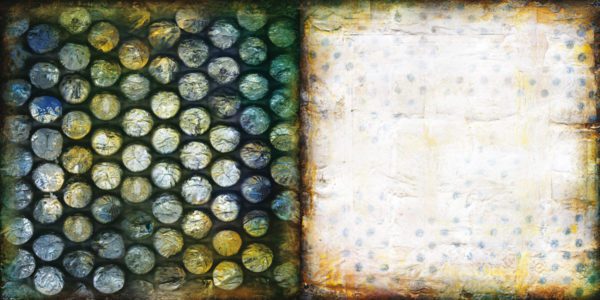
I think my favourite paper from the new collection is this one, called 'Mushroom and Smoke':


I love the large dots and was inspired to try creating some template based ATCs. As usual I've made backgrounds with no idea of what to do with them, but what does that matter :0)

The first ATC was covered with wild honey distress stain the stamped in aged mahogany. I sponged white paint over it all to tone down the colours,  then punched different sized circles out of a separate piece of card and used this as a template to sponge on more white paint. I then sponged on some more aged mahogany round the edges - the paint acts slightly as a resist to the ink. Finally I added the bird in black archival.

The second ATC is coloured with broken china, crushed olive and stormy sky distress inks (finally got away from the aged mahogany for a moment or two!), by applying them to my craft sheet, spraying with water then smooshing the card through it, drying and repeating until I was happy with it. I stamped on some checkerboard bits in the same colours,  then used a die cut from a Tim Holtz on the edge die as a stencil for sponging on white paint. The houses didn't show up too well so using the die cut as a stencil again I sponged on some glossy accents. when that was dry it worked as a resist for some more stormy sky ink to emphasize the houses.   


I may add further embellishments to these later - what do you think?

xx


Making a mess

I have to admit that I have a slight obsession with aged mahogany distress ink - I love this colour!!
Playing around with some messy techniques yesterday, I came up with three ATCs that use this colour in different ways.

The background of the first two is a combination of wild honey distress stain and aged mahogany and dusty concord distress inks. Butterflies and birds were stamped in black archival. Flourishes were stamped using white paint and I also smeared some more white paint on with an old credit card.

I love the way the aged mahogany blends with the dusty concord and zings against the wild honey colours in these ATCs.


The final one was simply aged mahogany and white paint. I smeared paint roughly over the ATC using a credit card and added the ink over the top, blending with a wet paintbrush. It shows up as more intense colour where there is no paint, and turns a lovely pink shade over the paint. I then stamped some Hero Arts heart stamps in the paint and ink.


I think these techniques are great for making backgrounds, but I find it so hard to cover them up with anything - I just end up loving them just as they are. Is it just me that has a love affair with backgrounds?

Sarah
xx

Wednesday, 2 November 2011

Mirror number 2

A couple of posts ago I showed an ikea mirror I'd decorated on a travel theme; today I've got another mirror to show you. It's in a very different style to the last one - a bit of a shabby chic look.

I embossed some cardstock with embossing folders from the Tim Holtz damask and regal flourishes set. I cut into squares and glued to the mirror in a chequerboard pattern. 


I covered the whole frame with a thin layer of tissue glued down with a watered down mix of matt multi-medium, then painted it with Paperartsy fresco finish paint in London Night.
Once that was dry, I dabbed white paint over the raised areas and edges. Finally, I stamped a few words in white paint. 


My husband loves the last mirror I did, but isn't very keen on this one at all. Hopefully it's just a matter of taste - probably a bit too girly :0). I like it, but I'll be interested in what everyone else thinks.

Sarah
xx

Monday, 24 October 2011

A mirror for a wanderer

I'm aiming to make quite a few handmade christmas presents this year and one of the things I'm trying is jumping on the bandwagon of decorating Ikea mirror frames. I've seen so many people using them to make some fabulous art and they're an absolute bargain at £1.25 each!

I have various ideas for what to do with the 6 I ended up buying. For the first one I was inspired by an article in this months Craft Stamper magazine where they used reinkers and craft glue to make a fantastic collaged mirror frame. Quite a few papers from my Tim Holtz paper stashes are travel related, so I thought I could do something similar on a travel theme for a globetrotting friend. However, what I ended up with was a much simpler piece than I originally planned...


I started off with a single sheet of map design paper from Tim's Lost and Found paper stash. I cut out the two halves of the globe to use as the main images and used the reverse of the leftover paper to make the background. I edged all the bits in vintage photo and stamped some splatters round the edges of the background pieces.

The mirror frame edges were stained with walnut stain distress stain.

Somehow, I managed to trim the papers so there was a hole in the right place for the mirror, then I glued down the images with matt multi medium.

Using vintage photo distress ink again, I stamped the birds at the top and used a a Tim Holtz mask to create the compass at the bottom, adding the game spinner as a compass pointer.


The strap down one side was made with grunge paper, stained with walnut stain and vintage photo, embossed with a texture fade and highlighted with black soot distress ink and some coppery rub on. I then gave it a coat of multi-medium. Hopefully it looks a bit like leather. The studs are the tops of some brads glued on. The word in the book plate came from the same sheet of paper as the rest of the design.


The final detail was the phrase at the bottom, which I think was perfect for theme of this piece - I used a left over scrap of paper, stamped in vintage photo and clear embossed.

So thats my Holtzian travel mirror and I'm so pleased with how it turned out.

Thanks for reading, I hope you like this as much as I do :0)

Sarah
xx


Saturday, 22 October 2011

Anniversary card

Just a quick post to share an anniversary card I made for my in-laws, and some tags I made to go on the bottles of wine we got them as a present.

Firstly, the card...


It's mostly Tim Holtz products (no surprise there). The background was inspired by this tutorial on the Gingersnap creations blog showing how to make your own kraft resist style paper. I used the Papillon stamp set  - stamped the background in archival ink, then clear embossed the butterflies, then coloured over the top with distress stains and inks.

I cut the flowers from book pages using the tattered florals die and stained with distress ink and added the skeleton leaves (I've had these for soo long and not really found good ways to use them, but I really like this).

On to the tags:


These were again inspired by a tutorial on Gingersnap creations. The tutorial was on an alcohol resist technique on glass. I didn't have any glass so I did something similar on acetate.
For each tag I cut two pieces of acetate. I coloured one of them with alcohol inks, then stamped the Papillon background stamp onto the alcohol inked surface using archival ink. I dabbed the archival ink off and it takes away the alcohol inks below leaving the image as a resist.
On the second piece of acetate, I simply stamped my other images in Black Stazon.
Finally I layered the acetate pieces up with a piece of white paper to show the background clearer and fastened the layers together with some mini brads.

Anyway, hopefully my in-laws will like them - if not I'm sure they'll still enjoy the wine.
xx

Thursday, 13 October 2011

Once upon a midnight dreary

The skeleton piece I did for Grungy Monday inspired me to do another tag using the same skeleton stamp.
.... and since Gingersnap Creations are currently running a horror themed challenge I thought a Edgar Allan Poe quote would be very fitting - in this case the opening lines from 'The Raven' which is one of my favourite spooky tales/poems.


The tag was coloured with crushed olive and forest moss distress inks and stamped in black archival ink. The skeleton stamp is from Kaycee Crafts, and I also used alphabet stamps from Studio G and a writing stamp from Paperartsy. The whole tag was covered with rock candy crackle paint, which I think makes the colour really zing. The little raven (well ok it's a bit too cute for a raven really, but its as close as I can get with my current stash) is a Tim Holtz die cut.

Now I really need to get on with all the christmas cards and handmade gifts I actually need to make, rather than playing :-(

Sarah
xx

Sunday, 9 October 2011

Moonlight and sunset

It's been ages since I entered any challenges so today I've done two tags for two of my favourite ones. Firstly, the Dragons Dream Tag It On theme this week is the whole of the moon. This is what I came up with:


The background started off with baltic blue fresco finish paint, crackle glaze and a top coat of black with white for the moon. The tree (from a Kanban set) was stamped with embossing ink and heat embossed with Moon Glow midnight sapphire obsidian powder. This is such a gorgeous deep shimmery blue and very fitting for the moon theme. I used some blue patina perfect pearls to add shimmer and stamped the tim holtz birds in black archival ink.


Hels Sheridans Sunday Stampers theme is blue and orange so I decided to create a similar tag with more of a sunset theme. 


The tree is the same dark blue embossing powder as the moon tag, and the background detail is done with the same blue perfect pearls as before, brushed over the pattern stamped in clear embossing ink. The background is wild honey and fired brick distress stains and ink. I know the blue doesn't show up too well in the photo so this one shows it a wee bit better.


I really enjoyed doing these and I'm starting to remember why I like challenges - they're fantastic for giving a bit of focus to my work. And I love seeing everyone else's fab work :0)


While writing this post I came across a great quote from Allen Ginsberg which I will leave you with.


"Follow your inner moonlight; don't hide the madness"


I like that sentiment


Sarah
xx

Monday, 12 September 2011

Starlight, Starbright

Finally managed to sit down yesterday and do some crafty stuff while watching the grand prix. We've just redecorated our bathroom and in the process we got paint on the light pull so I thought I'd have a go at altering it.

After getting craft stamper magazine and the freebie star stamp the idea really began to take shape, but I wasn't sure exactly what would work, so I tested out the idea on an ATC.


The background is baltic blue fresco finish paint, spattered and stamped with white and black acrylic (inspired by the fab work of Anika  - if you haven't seen her blog before, check it out). I also sprayed it with a turquoisy colour perfect pearl and rubbed with some turquoise metallic rub-on stuff.

I stamped the star image on a book page and cut them out. The birds were cut using the Tim Holtz movers and shapers die and outlined in black pen to match the stars. I also stamped little stars in wild honey distress ink and outlined in pen before cutting out. I glued them all onto the ATC card with multi medium.

I liked the look so I did a simplified version on the the light pull. No idea if this will really stand up to use in a steamy bathroom, but there's a big stick of dowling in the garage if I need to make another :0).


Have to say I love that star stamp so I also made this quick card, colouring with promarkers and layering with some fab spotty paper from Prima. I like the design but, was a little impatient with witing for ink to dry so it's a bit smudgy (might have to redo it and be more patient this time).


Friday, 19 August 2011

Don't panic

It was my husbands birthday today so that means I can finally show you the card I made for him. He's been  moaning about getting old (despite the fact he's slightly younger than me!) so I could help gently teasing - thus the 'don't panic' on the front of the card.

I used:
Tim Holtz papers to make the base of the card and the letters for don't panic.
Lots of distress inks (mostly vintage photo, forest moss and crushed olive) - I used the faux enamel technique (see here) for the inner panels and the key and keyhole.
Tim holtz dies  - cogs and gears, steampunk on the edge, and hardware findings
A mixture of clock themed stamps from Tim Holtz, PaperArtsy and Stampattack (free stamp with Craft Stamper magazine).


I borrowed the idea for the style of card from someone's blog, but I can't for the life of me find the link or remember who it was, so apologies to whoever it was and thanks so much for the inspiration.

Thanks for reading

xx

Wednesday, 10 August 2011

Wish upon a star!

It seems to have been ages since I entered any challenges and I know I won't have time for anything next week, so I made this tag to go in three challenges at once!

Firstly, it's for Grungy Monday where we have to use the Tim Holtz technique from 12 tags of Christmas 2010 day 10 (see linky here). This also means I can also enter Simon Says Stamp and Show, where the theme is show a Tim technique.

So I started off playing around with a couple of backgrounds and some embossed acetate/plastic packinging . Then I started thinking what I could do with it (working backwards as usual!). I added a few embellishments and realised that the whole thing reminded me a little of celestial charts - probably more to do with the colour than anything else - and so 'wish upon a star' seemed fitting... perfect for Hels Sheridan's Sunday Stampers wish theme this week.


The tag base was roughly painted with baltic blue fresco finish paint and I tried to rub some off before it dried to give it a more grungy texture. I then sprayed it with some blue/turquoise perfect pearls mist which has given it a wonderful petrol sheen (unfortunately it can't really be seen under the acetate, but I'll definitely be using this paint/pearl combination again). The tag and acetate were cut with Tim's large tag die and the acetate was embossed with a the retro circles embossing folder. The clock faces are cut from some Tim paper stash - I really loved how these looked with the circles on the acetate!

I stamped 'wish' and 'a' onto paper and used with bits from a 'make your own brad' set, and although you can't see it too well in the picture, 'upon' and 'star' are stamped around the edge of two of the clock faces.


So my wish for this week is that all the senseless violence spreading around this country ends soon. They were interviewing two teenage girls on the radio last night who hoped the riots would carry on because it was 'good fun'!!! It really makes me angry how mindless it all is, but I'll stop there before I really start ranting.

That's all for now. Stay safe and stay inky :0)

Sarah
xx

Tuesday, 26 July 2011

Dark dreams

Just a quick post tonight to share a card I've made for Sunday Stampers at Hels Sheridans fabulous blog. The theme is 'back to black' in tribute to Amy Winehouse and also seems very fitting with the tragic events in Norway.

I guess what I'm trying to say with this card is that if things seem dark right now,  you have to keep dreaming of a brighter tomorrow.


The main panel on the card is three strips of grunge paper embossed with Tim Holtz texture fades, coloured with distress inks (broken china, victorian velvet and dusty concord), and swiped over with black soot distress ink to cover the raised bits. The colour scheme was chosen to match the variegated thread I used to stitch the three pieces together. I then sprayed with some heirloom gold perfect pearls mist.

The book plate was cut from black card using the Tim Holtz tag die and painted with rock candy crackle paint which seems to have given it a bit of a leathery look. The white card in the centre was coloured lightly with the same three distress inks then stamped with 'Dream' in black archival. The finished book plate was fixed to the main panel with foam pads and some more of the pretty thread.
The butterfly and bird were cut using Tim Holtz movers and shapers dies and again painted with the rock candy crackle glaze. This time I added a little bit of colour with some metallic rub-ons.

Not sure if there is enough rock candy to really qualify this for this weeks Grungy Monday ('rock candy stickles or paint'), and it'snot come out very glossy, but I'll enter it in anyway. Would have been better for last weeks theme of grungepaper/board :-( but nevermind. Check out Tim Holtz's rock candy how to  here.

That's enough for now, thanks for visiting.

Sarah
xx

Saturday, 16 July 2011

Tim, Tags and Flying Time!

This week has gone past in a flash, so time flies seems a fitting theme for the first tag I want to share.


This was my first attempt at this weeks chosen technique for the Grungy Monday challenge  - Tim Holtz's rusty /faux enamel effect - see the details on his website here.

I used walnut stain distress stain over the tag and stamped a PaperArtsy image in vintage photo distress ink. I then covered the tag with clear embossing ink to do a slight variation on the rusty enamel technique. I used vintage photo over the top of the embossing. The butterflies were stamped from the TH Papillon set in stormy sky distress ink and clear embossed again with vintage photo over the top (same colours were used for the little Time Flies tag and the scrollwork at the bottom).  The butterflies and the sentiment were stitched onto the tag. I love the little metal leaf which actually came from a pair of earrings from Tesco.

I like the finished result, but I didn't think it really came out as a rusty enamel look... So now for number 2, again using a feast of Tim Holtz distress inks, alteration dies, texture fade embossing folder,  stamps and the rusty enamel technique.


This time I used crushed olive and forest moss distress inks to colour the tag, then clear embossed and went over the top with vintage photo. Then I stamped the birds in black archival. I stamped the Tim Holtz sentiment on white card, edged with crushed olive ink and matted onto black card. The little flourishy bits were cut from the on the edge scrollwork die I also used for the first tag. The flowers were cut with the tattered florals die, embossed with a flourish texture fade folder and coloured with the same distress inks as the tag, with a little additional black soot around the edges. I then attached the whole thing to a piece of white card, also edged with crushed olive, and finally onto black card. I love the colour combination of the crushed olive and black - it really zings in real life (is that even a word?)

I decided to enter the first tag into the Simon Says Stamp and Show challenge ('show some stitching') and Sundays Stampers ('flying').

The second tag will be entered into Dragons Dream Tag It On ('Project Tim Holtz') and Grungy monday ' Tims faux rusty enamel technique')

Going out for dinner tonight so I better go and scrub the ink off my fingers.
Hope you're all having a good weekend :0)

Sarah 
xx

Monday, 11 July 2011

Blooming gorgeous!

I'd put aside sunday afternoon for crafting time, but my mojo appeared to have slunk off into a corner, so I ended up watching most of the Grand Prix with my husband instead. What a cataloge of pit stop errors it was - I feel really sorry for Jenson Button and Paul Di Resta.

Anyway, eventually I put my mind to making a flower card for the Try it on Tuesday challenge and this is what I came up with:


Lots of wild honey, fired brick and vintage photo distress ink, Tim Holtz Papillon background stamp (and butterflies on acetate) and a big grungepaper flower. I like the contrast of the orange shades and the black background. Having nicely red and orange stained finger-tips for the rest of the day was quite cheering too.

I do like the finished card, but it's less original than I'd like. It's definitely been strongly inspired by all the gorgeous things I've seen other people doing - guess that can't be a bad thing really.

xx

Friday, 8 July 2011

The Age of Chivalry

I nearly titled this post '...and now for something completely different' as this weeks theme at the Dragons Dream Tag It on Challenge has got me thinking about Monty Python. The theme is 'the age of chivalry' which immediately brought to mind Monty Python and the Holy Grail - one of my husbands favourite films ever (he can quote huge sections of it practically word for word!).

However, after all that I haven't actually done a Monty Python themed tag (although I do have some ideas bubbling away for a future project...watch this space).

Here is my actual offering:

The background paper I think is from a range by Rusty Pickle called Guinevere - so quite fitting for the theme. The stamp used for the shield is from Paperartsy,  the crown and flourishes are from a Tim Holtz set, and the bird is from Graphic 45. There's also a little Making Memories fleur de lys stamp in each diamond in the background.

I used black soot and dusty concord distress inks on the shield. I swiped round the edges of the tag in clear embossing ink and heat embossed in gold. I also heat embossed the corner flourishes and the crowns on the shield in gold and the bird in black. The lettering was die cut from a Tim Holtz alterations die.

Annoyingly,  I've now got the knights of the round table song stuck in my head! Comic genius :0)


Sarah
xx

Sunday, 3 July 2011

Where flowers bloom

When we got back from holiday last weekend our front lawn was a sea of beautiful flowers - white clover, daisies, and what my Dad tells me is birdsfoot trefoil. Unfortunately our neighbours are very keen gardeners whose lawns are always perfect - literally they go round the edges with scissors! - and have been known to moan to our landlord when we don't keep the garden as neat as they'd like. So the pretty flowers had to be mown :-( It was almost heartbreaking, but I'm sure they'll grow back pretty quickly.

I took this photo before we got the lawnmower out (sorry for the quality - I don't think photography is really my strong point):


Anyway, this inspired me to make a flowery tag. I coloured an ATC sized piece of white card with butterscotch and stream alcohol inks, edged it in vintage photo distress ink and stamped 'Where flowers bloom...' a few times also in vintage photo. The stamp was from the flower fairies lavender set by Crafters Companion, which I got as part of some blog candy from Craft Stamping Magazine. When I first saw it I didn't think I'd use it as cutesy isn't really my style, but I've ended using it a few times now.


The flowers were cut from grungepaper using the Tim Holtz tattered florals die and coloured using alcohol inks (butterscotch, and wild plum) and distress inks (wild honey and vintage photo). I also stamped a Hero Arts script stamp over them using various different inks. The letters spelling flower were stamped in black in the center of each one.

I curled the petals a little and mounted them to the background card using foam pads. The whole thing was added to a plain kraft tag and to finish it off I added some ribbon and an acetate butterfly (stamped from the Tim Holtz Papillon set in black stazon and coloured with wild plum alcohol ink).

I think this tag fits the new Sunday Stampers challenge over at Hels Sheridans blog. The theme is writing and this tag has both the script stamp on the flowers and the phrase stamped on the background.
And the current challenge at the Stamp Man is alcohol inks so I'm going to enter it in that too.
Oooh and not to forget the Grungy Monday Challenge at Studio L3 where the theme is also Alcohol Inks - check out Tim Holtz's demo here!
...And finally Simon Says Stamp and Show - A word!

Thanks for reading and I hope you're having a good Sunday

Sarah
xx

Thursday, 30 June 2011

Altered tin

After tea the other night I spotted the empty tin of moroccan spice mix we'd used and thought it would be perfect for altering. After soaking it for a while to get rid of the spice smell (not entirely sure I succeeded) I set about to prettify it.


I used some Anna Griffin paper to cover the sides of the tin, distressing the edges with vintage photo distress ink. The flower on top used some of the same paper plus some grunge paper, cut with the Tim Holtz tattered florals die, again inked with vintage photo.  Before attaching the flower with the a decorative brad I stamped a flourish in black stazon on the plastic center.
Finally, I stamped some flower images in black stazon round the edge of the tin lid and added some brown ribbon to finish it off. 

Simple but pretty.

Thought I'd enter it in the Try It On Tuesday challenge which is altered boxes this week.

xx

Saturday, 25 June 2011

Cornwall, cider and a tag!

Got back yesterday from a lovely weeks holiday in Cornwall. The scenery along the coast is fantastic, wild and windswept with plenty of rocky peaks to clamber up and admire the view from. I must have looked an absolute state most of the time with my hair whipped up by the wind!

We stayed in a cabin at Deerpark Forest Holidays which was off in the middle of nowhere (Cornwall seems to be a maze of pretty single track roads with grass up the middle). It was a lovely spot and our cabin had massive windows and a deck that looked out into the forest.  We even had our own private hot tub on the deck - lovely to relax in with a glass of wine and watch lots of little birds flitting about in the trees.
View from our cabin
Our cabin
As well as soaking up the scenery (if not the sun so much), we had some delicious gooseberry ice cream, seriously tasty beer battered fish and chips from Rick Steins Fish and Chips in Padstow, and plenty of cider (we found some that was made on a farm near where we stayed that came in what looked like a windscreen washer fluid bottle but tasted great!).


Anyway, It's nice to be back home, catch up with everyones blogs and do a bit of crafting.

I originally set out today to make something inspired by the colours of some beautiful flowers and plants we saw at the Eden Project, but I got distracted and made the tag below instead! Its my entry for Dragons Dream Tag It On challenge, which has the theme of 'Faces' this week.


I used Graphic 45 steampunk papers and stamps (loving them at the moment!) and Tim Holtz distress inks, tattered florals die, and book plates. The visage word stamp was one of the freebie stamps with Craft Stamper magazine a few months ago.

Edited: I'm also entering this tag into the steampunk challenge at Just for Fun.

Think thats enough from me for now. Thanks for looking :0)

Sarah xx

Monday, 6 June 2011

Dreams


I have realised I have a (bad?) habit of making bits and bobs of backgrounds or embellishments with no clear idea, or no idea at all, of what I'm going do with it. 

I just got the Tim Holtz tattered florals die and of course had to test it out. I had some vague recollection of a challenge with 'red' as the theme and that stuck in my head even though I quickly realised that it was the Sunday Stampers theme and had just ended :-(... So I cut the flowers out of grunge paper and inked three of them with fired brick and black soot distress ink. I stamped a script design in black on edge of the largest flower and curled the petals - love the way you can do this with grunge paper and it stays in shape! I added a large brad as the centre and a tiny metal 'dream' tag.


I was really pleased with the flower, but had no idea what to do with it. After rummaging aimlessly through my craft drawers looking for inspiration for a while I found this little frame which is actually a magnet. It seemed to suit the style of the flower and together they had a dramatic gothic feel which I liked. Maybe it's a bit of a cop out - just sticking the flower in a fancy frame - but I love it.


I'd like to enter this into the Try it on Tuesday challenge with the theme of dreams.


Sarah
xx

Sunday, 5 June 2011

Time piece

The Dragons Dream Tag It On challenge theme this week is 'Time Piece' and, having plenty of clock related bits and bobs at the moment I jumped at the opportunity.

Umm, not entirely sure it went very well....

I started off with a tag cut from some lovely diamond patterned paper which I embossed with the Tim Holtz pocket watches embossing folder.  I lightly inked the raised areas with brushed corduroy and black soot distress inks. At this point I really liked the look of the tag but wasn't really sure where to go with it.

After I while I thought along the 'time flies' route and stamped some Tim Holtz birds onto acetate with black stazon.  This really started to give me a feel for the way I wanted the tag to go - a dark 'gotham cityesque' feel (the tags are darker than they look in the photos)- but it needed a focus point... Umbrella man seemed perfect and the phrase 'no time to stand and stare' came to mind.

So... finished tag no.1:

But I didn't like it - the phrase was too messy and took up too much space, it just looked too busy. So I tried again - this time doing all the stamping onto acetate which was overlaid onto the clock pattern tag. Unfortunately, I couldn't get as clear and crisp an image onto the acetate as I had before (any tips will be gratefully received), so as a quick fix I coloured the faint images with permanent marker (??). I wrote the phrase freehand onto the acetate.

Finished tag no 2:

I do sort of like this one better, but it's still not right (and I'm sure permanent marker was not the best tool for the job!).  Think I'm going to give up on this one - nice idea, poor execution!

Hopefully, today will go better :0)

Tuesday, 31 May 2011

Smile!

After being away since last wednesday I got home yesterday and it didn't take me long to get back to some crafty time.

I was having a play with a new Tim Holtz embossing folder and this card was the result. The tag was coloured with broken china and stormy sky distress inks before embossing, then I inked the raised areas of the embossed design with brushed corduroy ink and heat embossed with clear powder. I then got a bit stuck... until I found a bit of card that I'd used to test the on the edge steampunk die, which seemed to work quite well layered onto the tag. I finished off the card with the smile stamp panel coloured and heat embossed in the same colours as the tag - sort of inspired by Tim Holtz's rusted enamel technique from his compendium of curiosities book.


I'm not sure about the overall card but I love the texture and colour combination on the tag. Like quite a few things recently I did the background then found it really hard to bring myself to do anything with it because I found it so appealing on its own. I just love the effects I can get with combinations of embossing in the Big Shot, inking and heat embossing. It's so much fun just playing with different colours and textures - it really makes me smile :0)